React Native 앱에서 메뉴의 도움말 아이콘 클릭 시 간단한 설명(툴팁)을 보여주고 싶다면, 다음과 같은 라이브러리들을 사용해 볼 수 있습니다.
장단점을 보고 서비스의 용도에 맞추서 선택하는 것이 필요합니다.
1. react-native-paper의 Tooltip
- 특징:
- Material Design 기반의 심플하고 가벼운 툴팁 컴포넌트
- 터치(클릭) 시 간단한 텍스트 설명을 보여주기에 적합
- 커스텀 스타일, 위치 지정(top, bottom, left, right) 지원
- 장점:
- 설치와 사용이 매우 간단
- React Native Paper를 이미 사용 중이라면 통합성 우수
- 공식 문서: [react-native-paper Tooltip]https://callstack.github.io/react-native-paper/docs/components/Tooltip/
2. react-native-walkthrough-tooltip
- 특징:
- 풀스크린 오버레이 및 하이라이트 기능이 있는 툴팁
- 여러 단계의 온보딩/가이드 투어에 적합하지만, 단일 툴팁 용도로도 사용 가능
- 툴팁 위치, 스타일, 애니메이션 등 다양한 옵션 제공
- 장점:
- 복잡한 안내, 단계별 도움말 등 확장성
- 간단한 설명 툴팁도 구현 가능
- 공식 문서: [react-native-walkthrough-tooltip]https://www.npmjs.com/package/react-native-walkthrough-tooltip
3. react-native-tooltip-menu
- 특징:
- 버튼 클릭 시 애니메이션과 함께 메뉴형 툴팁을 표시
- 여러 개의 설명 항목을 한 번에 보여줄 때 유용
- 장점:
- 스타일 및 애니메이션 커스터마이즈
- 단일 설명보다는 메뉴형 툴팁에 적합
- 공식 문서: [react-native-tooltip-menu]https://www.npmjs.com/package/react-native-tooltip-menu
4. react-native-tooltip-2
- 특징:
- react-native-walkthrough-tooltip의 포크 버전
- 타입스크립트 지원, 커스터마이즈 강화
- 단일 요소에 심플한 툴팁 표시
- 공식 문서: [react-native-tooltip-2]https://github.com/WrathChaos/react-native-tooltip-2
추천 및 선택 가이드
| react-native-paper Tooltip | 심플, Material 스타일 | 단순 설명, 이미 Paper 사용 중일 때 |
| react-native-walkthrough-tooltip | 확장성, 온보딩/가이드, 위치 다양 | 복잡한 안내, 단계별 도움말 필요할 때 |
| react-native-tooltip-menu | 메뉴형, 여러 항목 | 여러 설명을 한 번에 보여주고 싶을 때 |
| react-native-tooltip-2 | 경량, 타입스크립트, 커스터마이즈 | 단일 요소에 심플한 툴팁, TS 프로젝트 |
GitHub - WrathChaos/react-native-tooltip-2: ✨ Customizable, easy to use tooltip for React Native 🚀
✨ Customizable, easy to use tooltip for React Native 🚀 - WrathChaos/react-native-tooltip-2
github.com
Tooltip | React Native Paper
Tooltips display informative text when users hover over, focus on, or tap an element.
callstack.github.io
실제 적용 예시
저는 타입스크립트를 사용하기 때문에 타입스크립트 지원하는 react-native-tooltip-2 라이브러리를 선택했습니다.
앱의 기능에 여러가지 다양한 서비스가 있어서 좀 복잡하게 보이지만 이렇게도 사용할 수 있구나를 보여드리고자 전체 코드를 포함했습니다.
- 공통 컴포넌트 생성 : CommonTooltip.tsx
import React, { useState } from 'react';
import { Text, StyleSheet, TouchableOpacity, View } from 'react-native';
import Tooltip, { Placement } from 'react-native-tooltip-2';
import Icon from 'react-native-vector-icons/MaterialIcons';
import { useTranslation } from 'react-i18next';
import { useTheme } from '../theme/ThemeContext';

interface CommonTooltipProps {
  i18nKey: string;
  position?: Placement;
  children?: React.ReactNode;
  tooltipStyle?: object;
  iconColor?: string;
  fontSize?: number;
  isDarkMode?: boolean;
}

const CommonTooltip: React.FC<CommonTooltipProps> = ({
  i18nKey,
  position = 'top' as Placement,
  children,
  tooltipStyle,
  iconColor,
  fontSize = 12,
  isDarkMode,
}) => {
  const { t } = useTranslation();
  const { colors, isDark: themeIsDark } = useTheme();
  const [isVisible, setIsVisible] = useState(false);

  const backgroundColor = colors.surface;
  const textColor = colors.text.primary;
  const iconTintColor =
    (isDarkMode ?? themeIsDark) ? 'rgba(255, 255, 255, 0.6)' : 'rgba(0, 0, 0, 0.6)';

  const handleClose = () => {
    setIsVisible(false);
  };

  return (
    <Tooltip
      isVisible={isVisible}
      onClose={handleClose}
      content={
        <View style={[styles.tooltipContent, { backgroundColor }]}>
          <Text style={[styles.text, { color: textColor, fontSize }]}>{t(i18nKey)}</Text>
        </View>
      }
      placement={position}
      style={[styles.tooltip, tooltipStyle]}
    >
      {children ? (
        children
      ) : (
        <TouchableOpacity style={styles.iconContainer} onPress={() => setIsVisible(true)}>
          <Icon name="help-outline" size={16} color={iconColor ?? iconTintColor} />
        </TouchableOpacity>
      )}
    </Tooltip>
  );
};

const styles = StyleSheet.create({
  tooltip: {
    padding: 0,
    borderRadius: 8,
  },
  tooltipContent: {
    padding: 10,
    borderRadius: 8,
    maxWidth: 250,
  },
  text: {
    fontSize: 12,
    lineHeight: 18,
  },
  iconContainer: {
    padding: 4,
  },
});

export default CommonTooltip;
- 실제 사용 예시
import React from 'react';
import { View } from 'react-native';
import CommonTooltip from '../components/CommonTooltip';

const ExampleScreen = () => (
  <View style={{ flexDirection: 'row', alignItems: 'center' }}>
    <CommonTooltip
      i18nKey="tooltip_example"
      position="bottom"
      // darkMode={true} // 강제 다크모드 적용시
    />
    {/* 또는 아이콘 대신 커스텀 트리거 사용 */}
    <CommonTooltip i18nKey="tooltip_profile" position="right">
      <Text style={{ textDecorationLine: 'underline' }}>프로필?</Text>
    </CommonTooltip>
  </View>
);

export default ExampleScreen;
- 주요 포인트
- i18nKey만 넘기면 자동으로 다국어 지원.
- position prop으로 툴팁 위치(top/bottom/left/right) 지정.
- darkMode prop으로 다크모드 강제 지정 가능(미지정시 시스템 설정 따름).
- children prop으로 아이콘 대신 원하는 트리거 컴포넌트 사용 가능.
- tooltipStyle, iconColor 등으로 스타일 세부 조정 가능.
- 공통 컴포넌트로 만들어 어디서든 import하여 사용 가능.
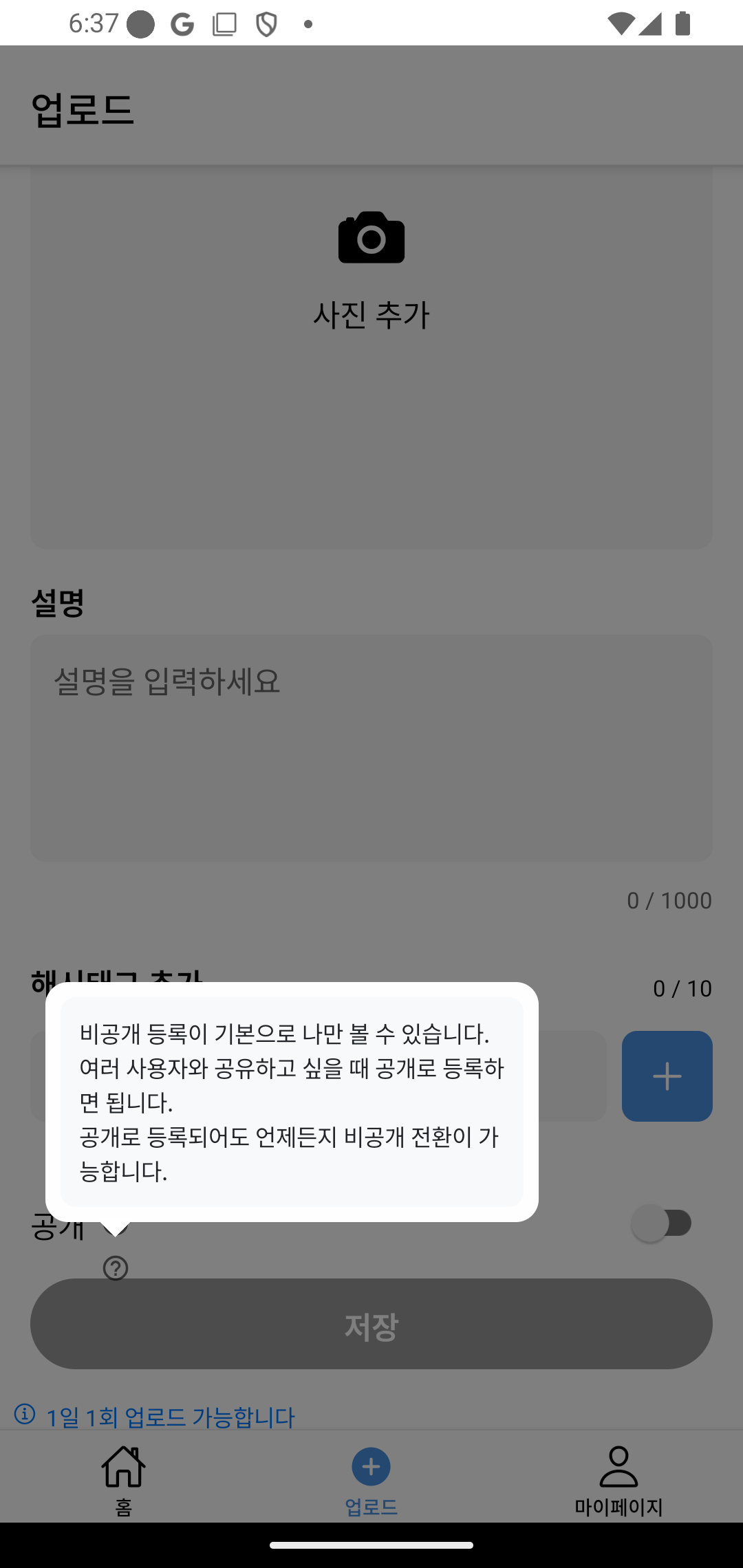
- 적용 앱 화면 예시
- 도움말 ? 아이콘 선택시 Tooltip 이 전체 화면 오버레이하여 보이고, 다른 곳 선택시 Tooltip 이 사라지도록 함.
- 간단한 문구도 되지만 아래와 같이 여러 문장을 넣을 수도 있음.
'리액트(React)' 카테고리의 다른 글
| [React Native] 이미지 위치정보 가져오기 (EXIF 포맷) (0) | 2025.04.18 |
|---|---|
| NoSQL Firebase Realtime Database vs Cloud Firestore 비교하기 (0) | 2025.04.08 |
| 구글 파이어베이스 스토리지에서 이미지 관리(1) (0) | 2025.01.16 |
| 리액트 성능최적화 하기 - useMemo, useCallback (1) | 2024.11.17 |
| React Native - 외부글꼴 사용 및 전역 색상관리하기 (0) | 2024.11.16 |


